
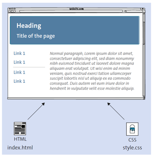
HTML defines the structure of web content, while CSS controls its style and layout. Together, they form the foundation of modern websites, powering everything from responsive design to accessible interfaces.

HTML was first developed by Tim Berners-Lee in the early 1990s as the foundational markup language for structuring documents on the web. By the mid-1990s, the World Wide Web Consortium (W3C) introduced CSS (1996) to separate content from presentation, giving developers greater control over design. Over the years, both standards evolved significantly—HTML5 (2008–2014) modernized markup with multimedia support and semantic elements, while CSS3 modularized the language and introduced powerful features like animations, flexbox, and grid layouts. Today, HTML and CSS continue to advance with a strong emphasis on accessibility and responsive design, ensuring websites are usable across devices and for all audiences.
HTML stands for Hypertext Markup Language, and it serves as the basic building block for all websites. It defines the structure of a web page by organizing content into elements and providing a hierarchy that browsers can render. Let’s discuss some key aspects of HTML.
HTML is a markup language, and not a programming language. Developers using HTML create the structure of a webpage through the use of sets of opening and closing tags. These tags are enclosed in angle brackets, like <tagname>. HTML tags describe the purpose of the content they enclose, such as headings, paragraphs, images, links, and more.
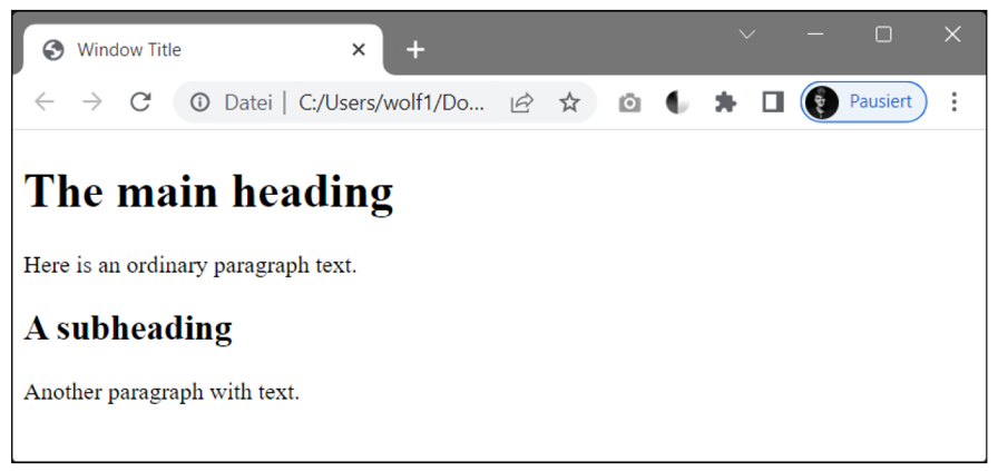
HTML documents follow a specific structure. They begin with a <!DOCTYPE> declaration, followed by the <html> element that encloses the entire document. The <head> section contains metadata, while the <body> section holds the visible content.
Semantic HTML involves using HTML elements that convey the meaning of the content. For example, using <h1> for main headings, <header> for header, and <nav> for navigation menus. This not only enhances accessibility, but also helps search engines understand the content better. Semantic HTML is essential for web accessibility (screen readers, WCAG compliance).
HTML elements often include attributes that provide additional information or configuration. For example, the <img> element has src and alt attributes for specifying the image source and alternative text, respectively.
While HTML provides the structure and content of a web page, CSS is responsible for its presentation and style. Standing for Cascading Style Sheets, CSS allows developers to define how elements are displayed, such as their size, color, position, and layout. Below lays out key aspects of CSS.
CSS uses style rules to define how HTML elements should be styled. A style rule consists of a selector and a declaration block. The selector specifies which elements the rule applies to, and the declaration block contains property-value pairs.
There are various types of selectors, from simple element selectors to more complex ones, like class selectors, ID selectors, attribute selectors, and hierarchical selectors.
Cascading and Specificity
The "C" in CSS stands for "cascading," which means that styles can cascade (or flow) from one rule to another. CSS rules are applied based on specificity, with more specific rules taking precedence. Understanding specificity is essential for utilizing CSS.
The CSS Box Model
The CSS box model defines how elements are rendered in a web page. Each element is considered a box, comprising content, padding, borders, and margins. By manipulating these components, developers can control the layout and spacing of elements.
Flexbox (Flexible Box Layout) is a CSS layout model designed to align and distribute space among items in a container, even when their size is unknown or dynamic. It provides powerful alignment options both horizontally and vertically, making it especially useful for responsive design. Common properties include display: flex;, justify-content, align-items, and flex-wrap. Flexbox is well-suited for one-dimensional layouts (rows or columns).
CSS Grid Layout is a two-dimensional layout system that allows developers to create complex and responsive grid-based designs. With grid, both rows and columns can be defined explicitly or automatically, giving precise control over positioning. Key properties include display: grid;, grid-template-columns, grid-template-rows, and gap. Grid is ideal for structuring entire pages or large-scale sections where alignment along both axes is required.
CSS Frameworks
CSS frameworks are pre-prepared libraries that provide a set of standardized, reusable styles and components, simplifying the process of designing and styling web pages. They often include a grid system, typography styles, and UI components, allowing developers to create responsive and visually consistent designs more efficiently. Below, we discuss some of the most popular frameworks.
Ant Design
Ant Design is a popular framework with a set of high-quality React components. While primarily designed for React applications, it also provides stylesheets for non-React projects.
Bootstrap
Bootstrap offers a comprehensive set of HTML, CSS, and JavaScript components, such as navigation bars, modals, and carousels, making it easy to create modern and responsive web interfaces.
Bulma
Bulma is a modern framework based on Flexbox. It's known for its simplicity and ease of use, offering a clean and modular structure. Bulma doesn't rely on JavaScript, making it lightweight and easy to integrate.
Foundation
Foundation provides a responsive grid system and a collection of UI components. Foundation focuses on customization and flexibility, allowing developers to choose the components they need and tailor the framework to specific project requirements.
Materialize CSS
Based on Google's Material Design guidelines, Materialize CSS brings a clean and modern look to web development. It offers a set of components and styles that align with Material Design principles.
Sass Frameworks
Some frameworks leverage the power of Sass, a popular CSS preprocessor. Examples include Bourbon, Neat, and Susy, which provide Sass mixins and functions to streamline the styling process.
Semantic UI
Semantic UI focuses on creating human-friendly HTML, making the code more readable and easier to understand. It provides a variety of UI components and a theming system for customization.
Tailwind CSS
Tailwind CSS takes a different approach by providing low-level utility classes that you can compose to build designs directly in your markup. It offers great flexibility and is highly customizable.
UIKit
UIKit is a lightweight and modular front-end framework that comes with a variety of components and a responsive grid system. It's known for its simplicity and versatility.
Utility-first frameworks like Tailwind CSS provide low-level utility classes (e.g., flex, mt-4, text-center) that can be combined directly in your HTML to rapidly build custom designs. This offers high flexibility but can lead to verbose markup.
Utility-first frameworks like Tailwind CSS provide low-level utility classes (e.g., flex, mt-4, text-center) that can be combined directly in your HTML to rapidly build custom designs. This offers high flexibility but can lead to verbose markup.
HTML and CSS are inseparable in web development. They work together to create web pages that are not only structured and semantically meaningful, but also visually appealing. HTML organizes content into headings, paragraphs, lists, and more. However, it doesn't specify the appearance of these elements. That's where CSS comes in. CSS is used to style HTML elements, setting their colors, fonts, sizes, and layout.
With the proliferation of mobile devices, responsive web design has become essential. HTML and CSS work together to create responsive layouts that adapt to different screen sizes. Media queries in CSS allow developers to apply different styles based on screen width.
HTML and CSS aren’t the only technologies involved in web development. While they handle the structure and presentation of a web page, JavaScript adds interactivity and functionality. JavaScript allows you to create dynamic web pages by responding to user actions, handling form submissions, and making asynchronous requests to a server.
HTML and CSS power everyday interface patterns. These are the most frequent scenarios you’ll build.
Becoming proficient in HTML and CSS is an excellent starting point for a career in web development. You need to master many different concepts to become an HTML & CSS developer. To get started, explore the fundamentals. Understand HTML's structure, tags, and attributes. Familiarize yourself with CSS's selectors, properties, and values. Next, learn the importance of semantic HTML and how to use elements that convey meaning. Explore elements like headings, lists, links, and forms. Find out about web accessibility principles and how to create web content that can be used by people with disabilities.
To learn about CSS, start with the CSS box model, which defines how elements are rendered. Learn how to control content, padding, borders, and margins. Look into the principles of responsive web design: Master media queries to create layouts that adapt to different screen sizes. To make the webpages look great, explore CSS frameworks like Bootstrap and Foundation. These frameworks provide pre-built styles and components, making web development more efficient. Then read up on CSS preprocessors like Sass and Less, which can help you streamline your stylesheets, and CSS layout techniques like Flexbox and CSS Grid.
To make the most of your studies, there are additional, related topics to become familiar with. Look up version control systems like Git, which helps track changes to your code and allows you to easily collaborate with other developers. Learn how to optimize for performance by reducing page load times and optimizing images. Research how to debug HTML and CSS to identify and solve issues. Then dive into a real web project. Start with simple websites and gradually work your way up to more complex applications.
Web technologies evolve rapidly. So it’s important to stay updated with the latest HTML and CSS features, as well as best practices in web development.
Future of HTML and CSS
HTML and CSS continue to evolve with browser support accelerating modern features that make layout and styling more expressive and maintainable.
@container) let components respond to the size of their container—not just the viewport—enabling truly reusable, layout-aware UI.Here are answers to some of the most common things web developers want to know about HTML and CSS.
What’s the difference between HTML and CSS?
HTML defines structure and content; CSS defines presentation and style.
Is HTML a programming language?
No — it’s a markup language.
Do you need CSS frameworks?
They are not required, but they speed up development and enforce consistency.
Which is better for layouts, Flexbox or Grid?
Flexbox = 1D layouts, Grid = 2D layouts. Many projects use both.
Why is semantic HTML important?
It improves accessibility and SEO, helping both screen readers and search engines.
In addition to the information laid out above, there are a handful of important terms you should also know:
Want to learn more about HTML and CSS? Additional information can be found in the blog posts and books listed below.
Learn more computing from our official Learning Center.

And to continue learning even more about HTML and CSS, sign up for our weekly blog recap here: